
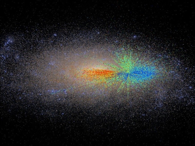
The Milky Way chart colored by age
With the aid of new methods and existing technology, astronomers created the age chart of the Milky Way, showing the beautifully complex map of our galaxy. It’s the first ever “growth chart” that clearly displays the evolution of stars littered around the galaxy from the youngest to the oldest.
Scientists at the Max Planck Institute for Astronomy managed to create this cross-representation by using the age of over 70,000 stars over a distance of 50,000 light years away. It’s an exquisite mapping that confirms a popular theory by using familiar methods to the scientific community. Specifically, they found proof of the galaxy’s evolution pattern.
It has been suggested for numerous years that the Milky Way’s oldest stars reside in its center. New stars stretched further away from the of swirling gas and dust, forming and spreading out to what we have today. According to one author of the study, Melissa Ness, the galaxy “grew up” by “growing out”. The story can clearly be seen unfolding on the map.
The advantage was that, today, we have numerous individual stars known and proper methods to determine their age. For this particular study, the team of astronomers used two methods.
First, they observed data from the APOGEE (Apache Point Observatory Galaxy Evolution Experiment) survey. As stated by the principal investigator, Steve Majewski, the APOGEE was the ideal study as they could make observations upon 300 stars simultaneously. Seeing more at the same time aided in offering a broader perspective, and getting the full spectrum of around 70,000 red giants.
However, the age of the stars cannot be properly determined with the use of the APOGEE study alone. So, secondly, the researchers used data observed by NASA’s Kepler satellite, whose main goal is to find new planets and stars. It provided the missing link, by combining the information given by both techniques. Using the spectra of the APOGEE and the light curves seen by Kepler, they could measure the age of the 70,000 observed stars.
That was done by using the fusion clock inside every star. If they knew its mass, they could determine its age.
What resulted is now a “map for the ages”, as there are many individual stars that can been seen streaked across the map and the Milky Way. The spectacular representation has unprecedented detail. It could help astronomers eventually reconstruct the entire history of our galaxy with each star in part. That means knowing when they formed, where they are, and how they got there.
And, more importantly, to answer questions about the production of numerous elements, planets, and, implicitly, life.
Image source: mpia.de


